View on Instagram https://instagr.am/p/C0RIlWMrejq/
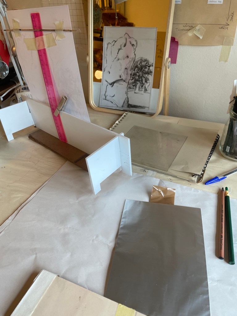
One of the things I realised this last week is that when I go in to my studio, I love the ritual involved in the preparation. If I’m moving from painting to printmaking, I put the handles back on the press and shift it away from the wall to make room for the print bed. The pressure needs to be checked for whatever plate/paper combination I’m going to use, paper cut and dampened and the large square of glass put on the bench ready so I can roll up the ink. Any drawing I’m working from is propped up on the desk where I can see the sketch in the mirror (so the print will be the correct way round). I set out whichever tools I need and then, finally, start to work.
Given I’ve more time at home this summer than originally expected, I decided to have another attempt at kitchen lithography. This is a process invented by Emilie Aizier in 2011; it’s a form of printmaking which reproduces stone lithography conditions but uses fairly standard household items. I’d tried the method a couple of times in the past with limited success, but having seen some wonderful results that others have achieved wanted to give it another go. There are a huge number of tutorials and videos on the process out there – this is the one I watched:
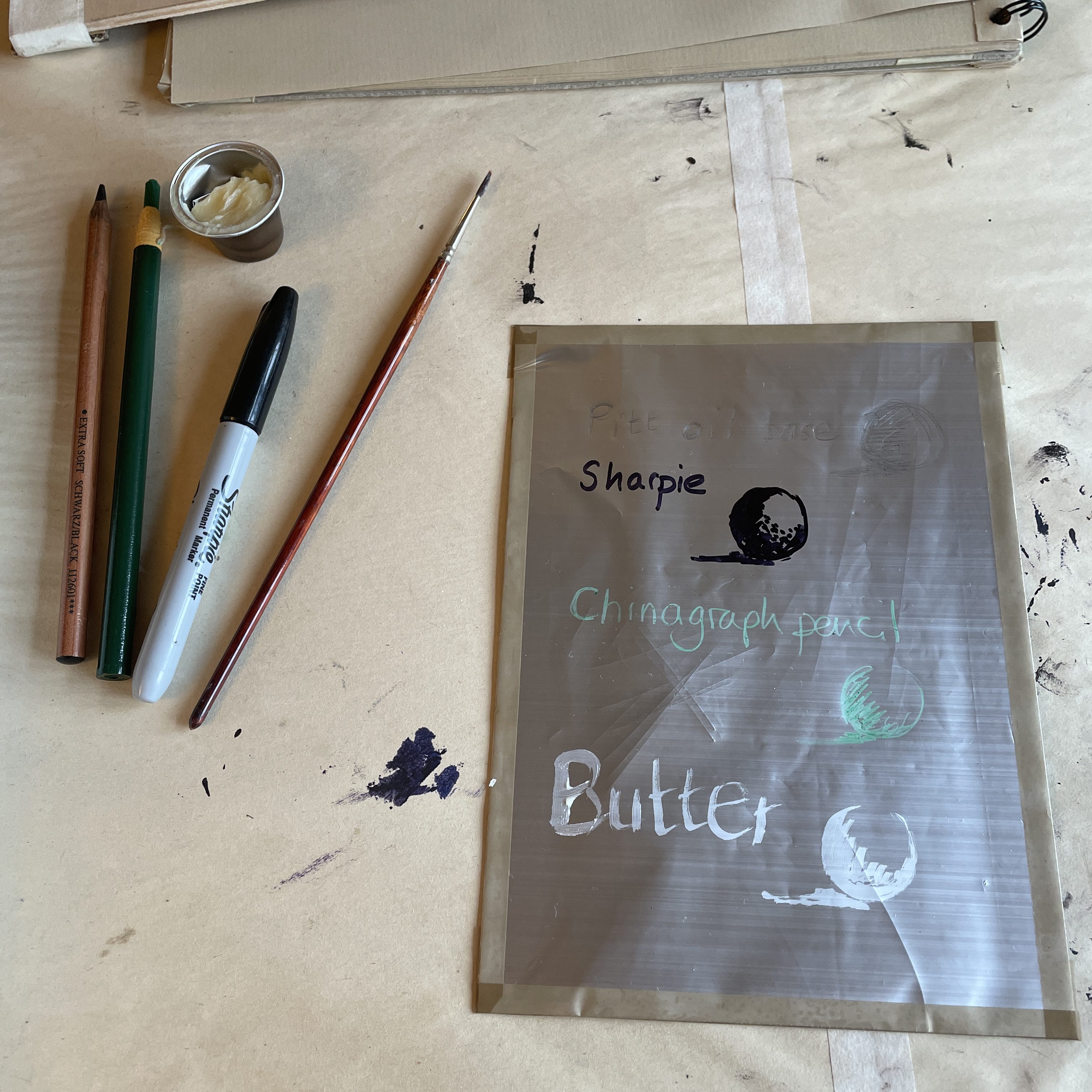
I started by testing out different mark making methods. The plate itself is simply kitchen foil, matt side up, parcel taped to a piece of perspex. Having drawn / painted onto the foil (making sure I got no greasy fingerprints on it, as they would show in the print), I poured coke over it. Next steps were to wash the plate in water, wipe away my marks with some vegetable oil then damp the plate with a wet sponge and finally ink it up and print it. Simples!

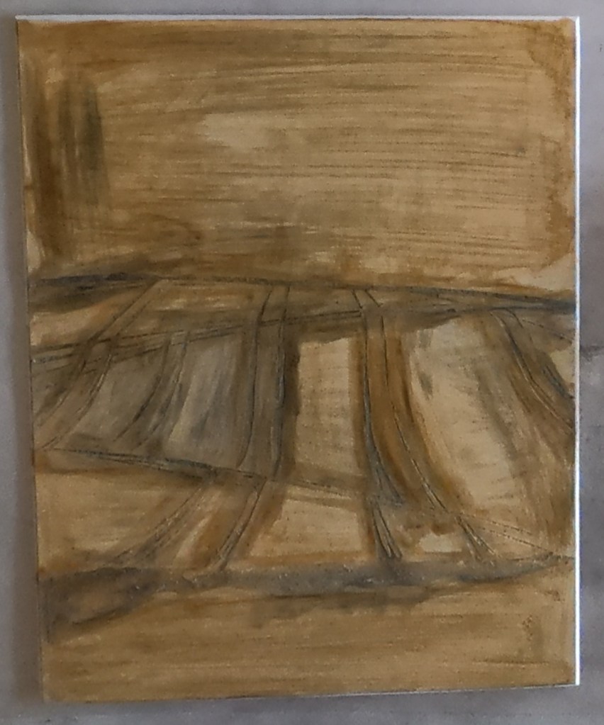
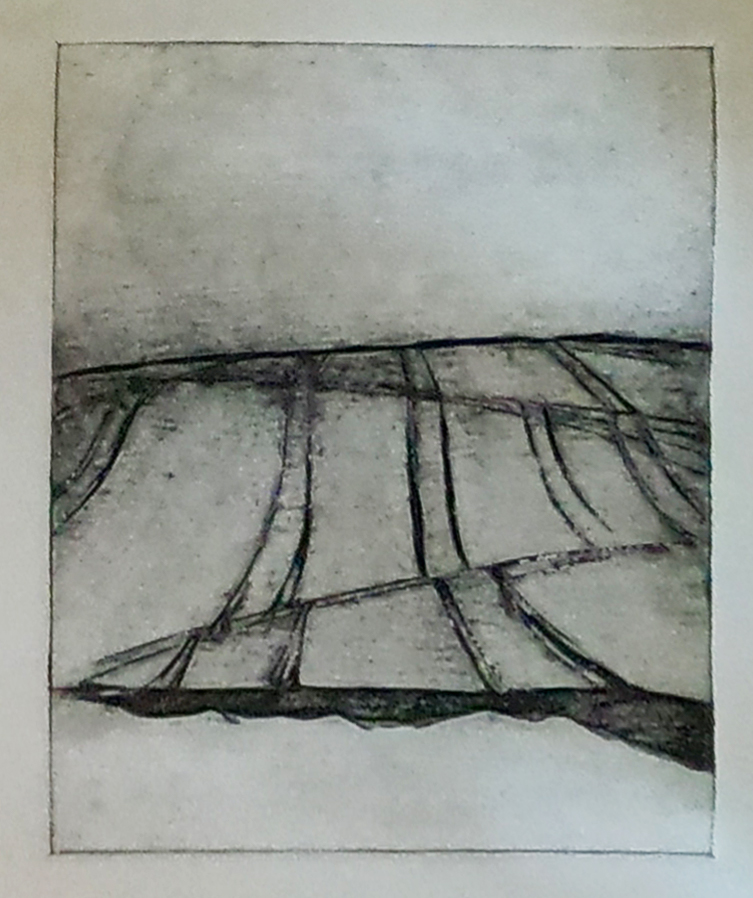
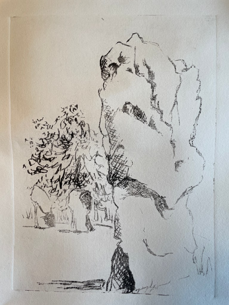
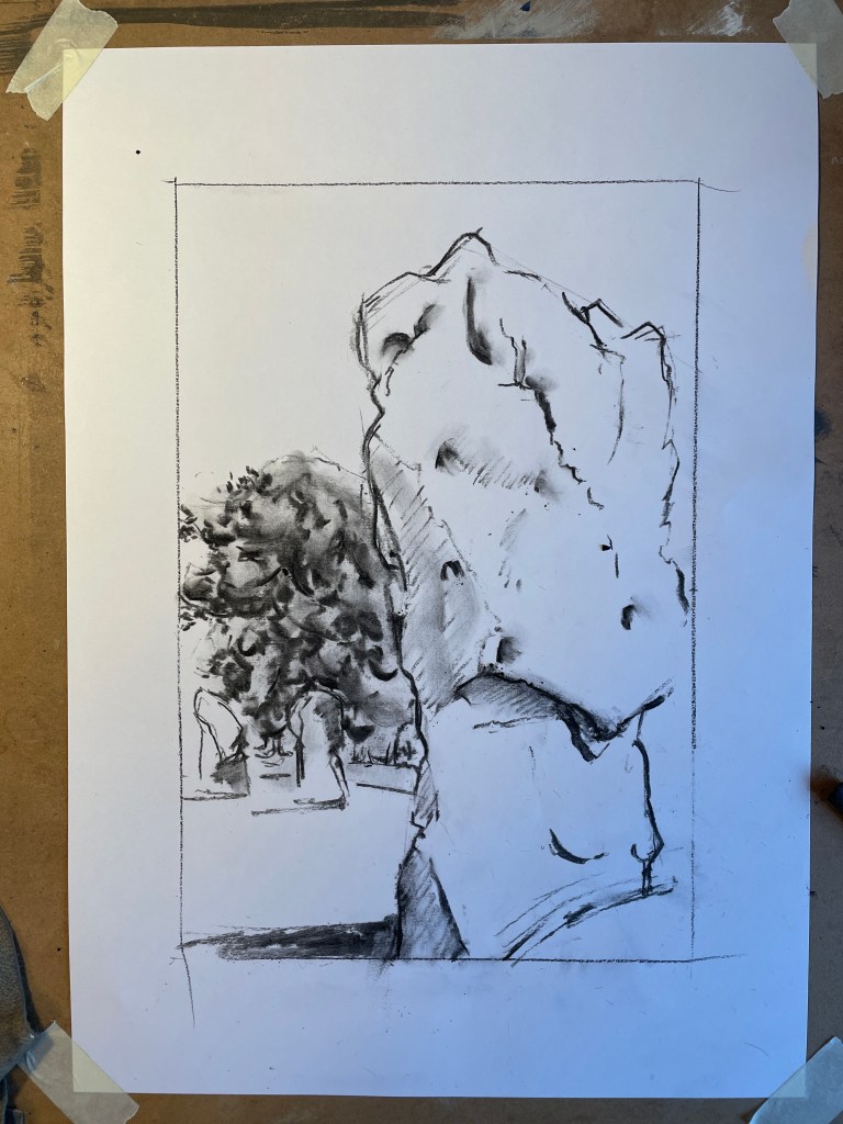
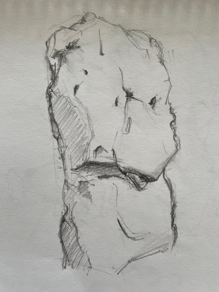
The butter painting had not gone well, although I think I’d not really given it enough time in the coke. I also realised I couldn’t have parcel tape around the edge, so made my second plate slightly differently with the parcel tape only on the back face. I decided to try and make a litho drawing of the Avebury stone that I’m working on as a lino cut, given I know the image quite well.
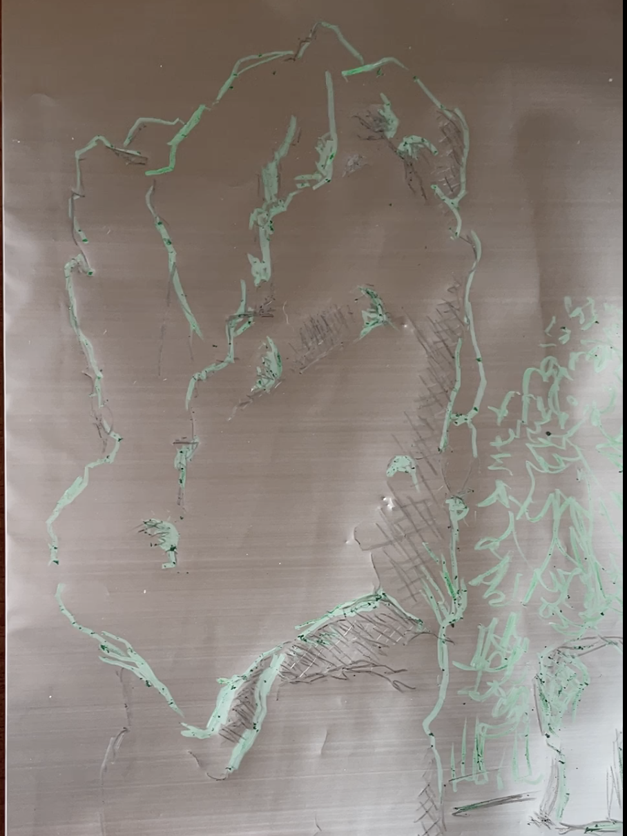
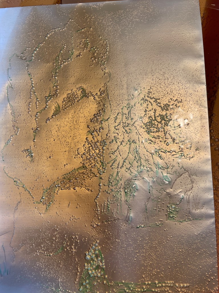
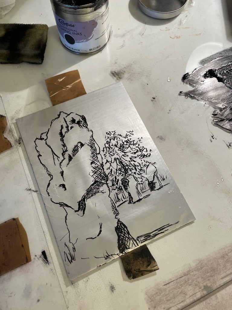
It was fascinating wiping the plate and seeing the ink darken up as it stayed on the drawn areas. I made three prints all told, but the plate was easily capable of producing more:
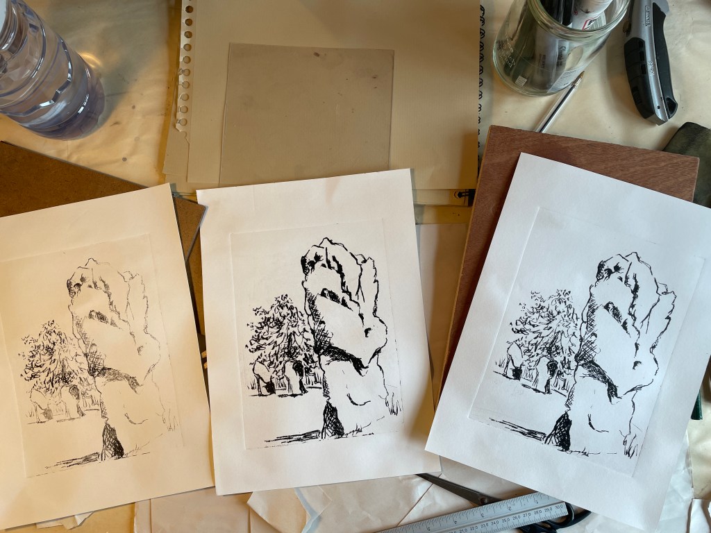
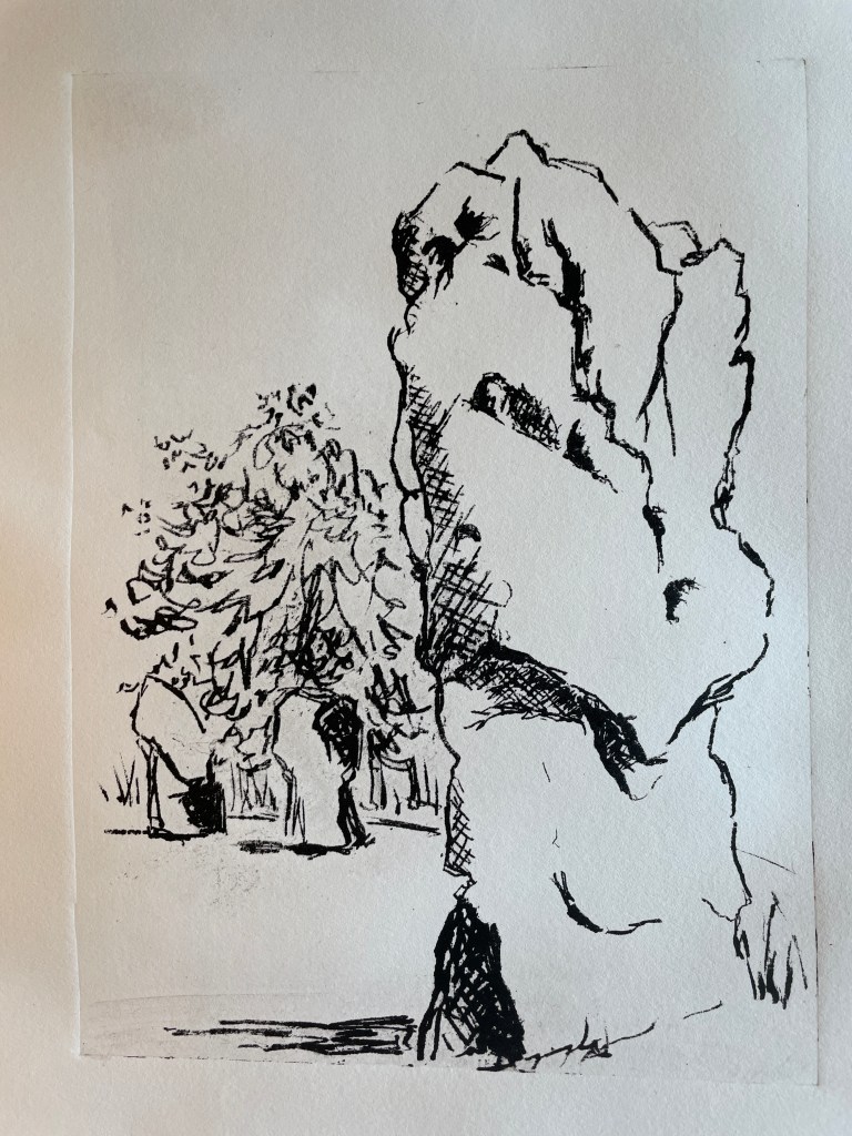
Overall a very satisfying session – I really enjoyed the direct drawing to print method and look of the finished print. I’m thinking maybe lithograph prints alongside lino cuts of different standing stones, or maybe producing a series of lithographs and doing some bookbinding / bookmaking with them. Now there’s an art form with plenty of scope for nice and accurate rituals…
I started writing this about 15 minutes after discovering that due to dog paperwork reasons (not our fault), our summer holiday in France is off. So I apologise if what follows comes across as slightly lacking in joy, but having managed a post each week recently, I was damned if I was going to miss this one due to a case of the Holiday Cancelled Blues. Deep breath and here goes…
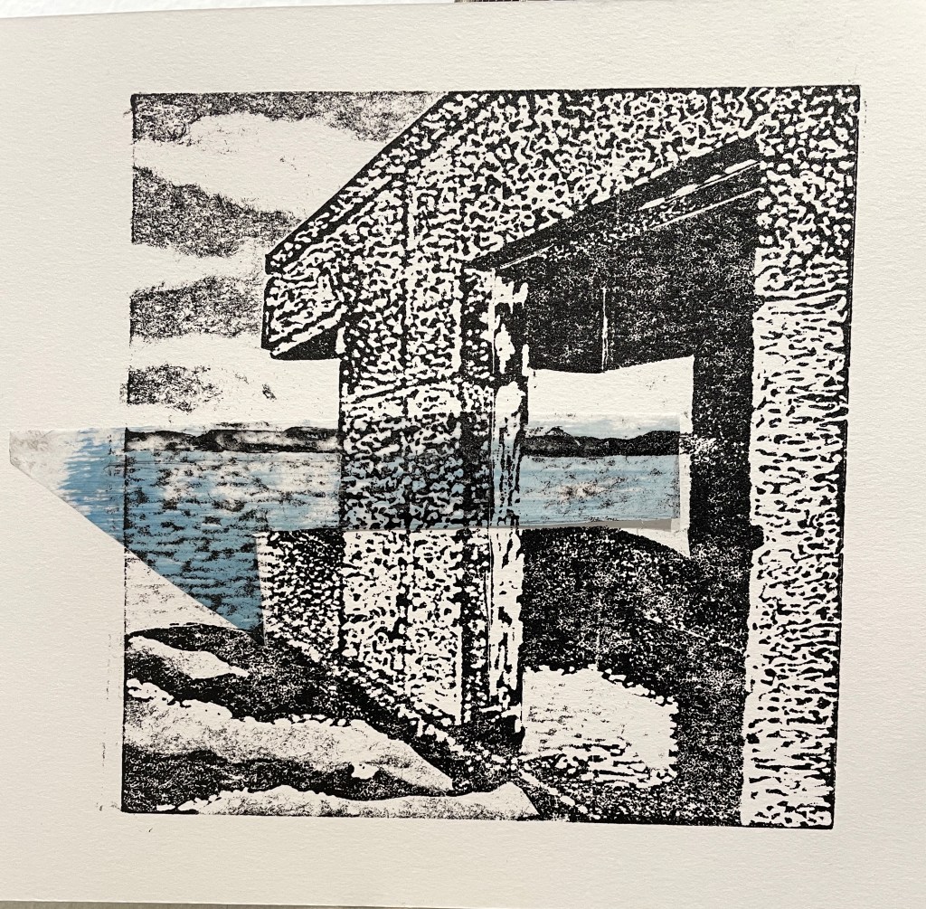
It was all going so well too; for quite some while I had been interested in the remnants of the WWII defences built along the Kennet and Avon canal. I liked the rather odd sight of a squat concrete pillbox set against the rolling hills or along field edges and it seemed a natural progression to some of the pieces I’d done in Ullapool on the buildings left from the Arctic Convoys.
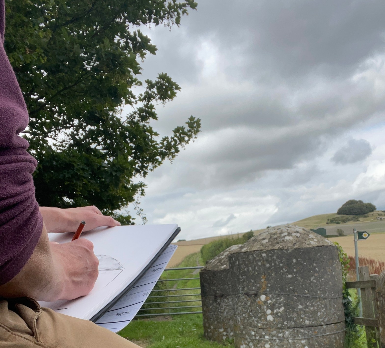
My location scout (thank you Bruce) suggested some tank traps that were on a bridge over the canal, we walked the hound together to the site then I was left to sketch while husband and said hound set off along the towpath.
The tank traps were rather imposing lumps of concrete and I liked the way they echoed the form of the hill in the background. Added to that was the presence of a Wiltshire ‘clump’ – a beech copse on the hill summit – plus an interesting farm building in the mid ground.
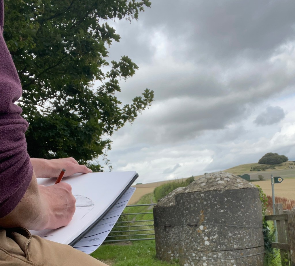
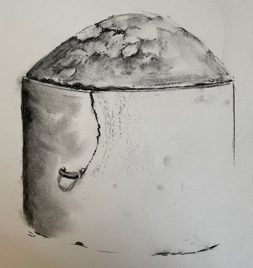
I found capturing the patterns of the lichen on the cap of the bollard challenging; a problem that remains to be solved, but I did enjoy drawing the small iron ring for some reason.
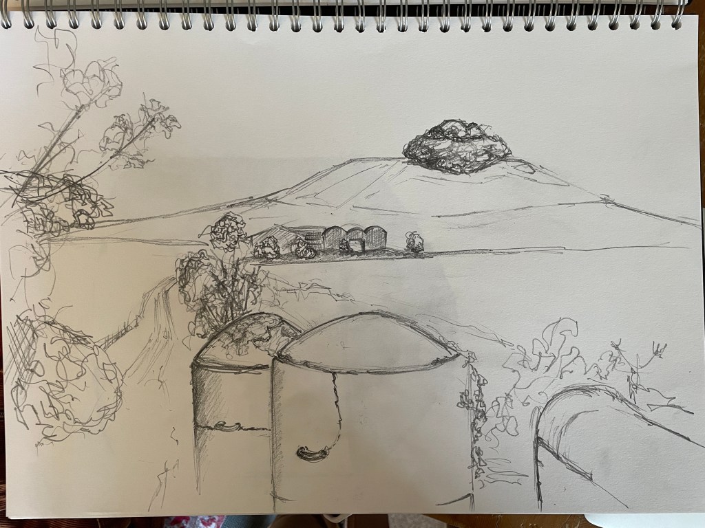
I worked in pencil to sketch the whole scene, then time was up as ice cream called so I headed back to collect the car and meet up with the rest of the pack. I did have plans to continue working from this sketch or possibly continue with a linocut of the Avebury stones that I started a couple of days ago, but I think in the circumstances I’m going to opt for a Pastis instead. I’d like to think that yelling ‘Muttley – doooooo something!’ could fix our travel paperwork problem, but no, this year we will be on a staycation. Triple drat.
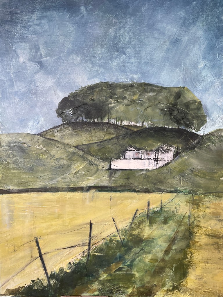
I think I may have actually finished a painting. I spent two final sessions working on a couple of areas I wasn’t happy with, and have got as close (I think) as I can to where I wanted it to be.

This is exciting but also a problem, because now I’ve got to move on to something new, so I’ve been checking out the sketches I did at Avebury with a view to making a print of some kind. I’ve been loving the figure monotypes, but with the summer holiday coming up and the chance to work on a longer project, I thought it would be a good time to go back to linocuts.
I went back to the sketches I made on location and started to play around with composition by masking off areas. Next I sat down to make a new drawing – helping to remind me of the shapes and features of the stone. It also gives me thinking time; for me a large part of print making is problem solving, and the process of drawing allows me to start to work out how to use marks to capture the character of the stones.

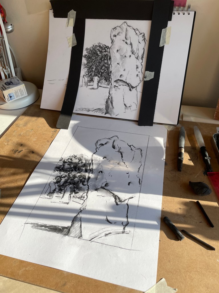
I’m really looking forward to translating this into print. It’s been a while since I’ve used my beautiful Pfeil linocut tools; the whole process of carving a block and seeing the image start to reveal itself is really exciting. This should keep me busy for a while!
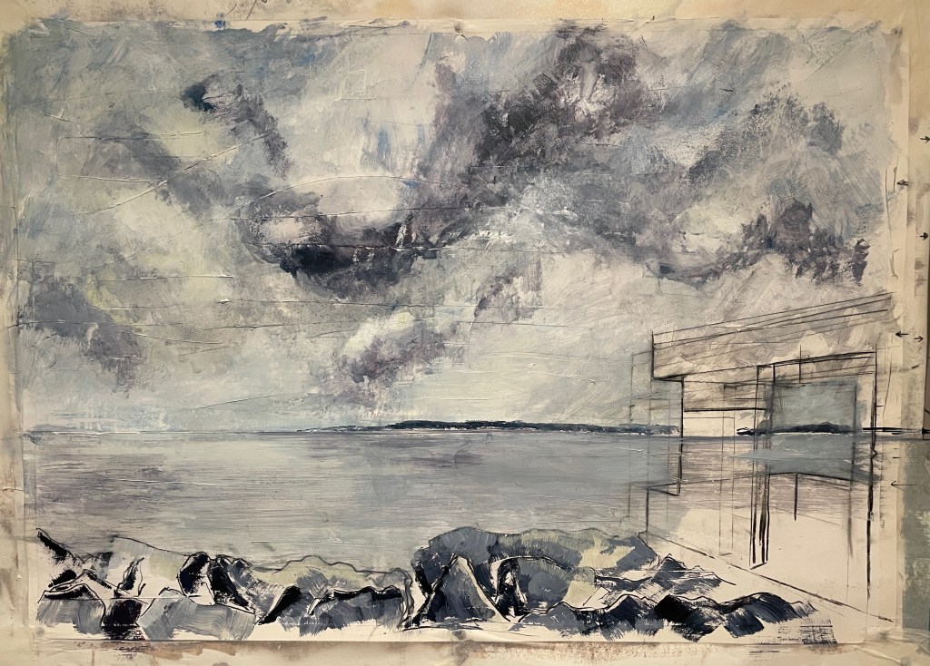
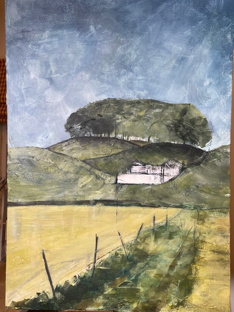
When I was on the Portfolio Course in Ullapool, one of the other students shared Sister Corita Kent’s ten rules with us as we started work on our projects for the end of course exhibition. I love these rules and each of them has helped give me a push at different points as I’ve been working. I’d started work on a Wiltshire landscape some weeks ago. I’m finding landscape painting in Wiltshire has a whole set of different challenges to those in Scotland. I saw Scotland as sky and weather dominating almost everything else. Wiltshire’s weather is far gentler, but the land has fascinating folds and contours needing a new approach. I wasn’t happy with my initial efforts, but just like with the cancelled sketch meet a couple of weekends ago:
I went back to the piece and made an effort to develop it further and find a more effective visual language.
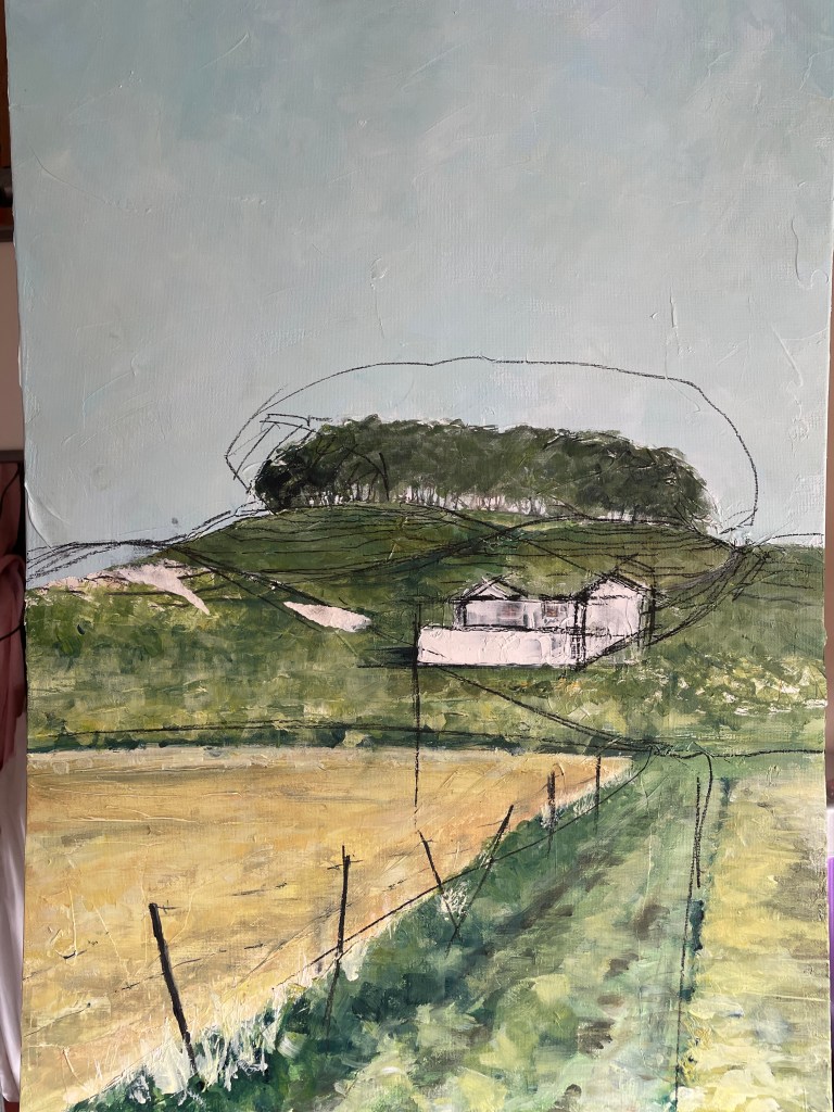
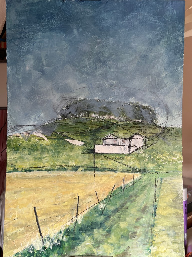
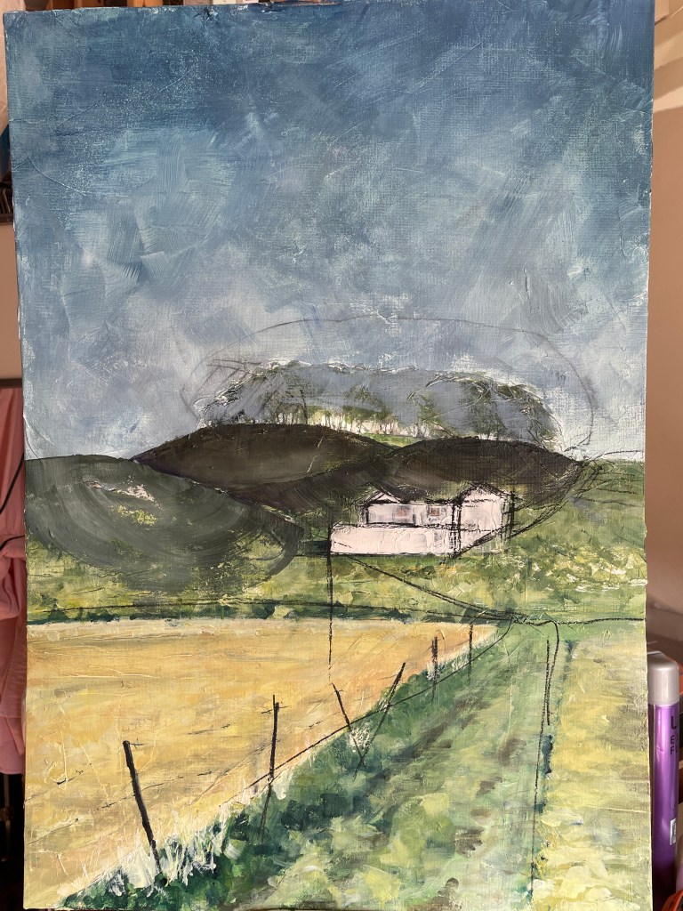
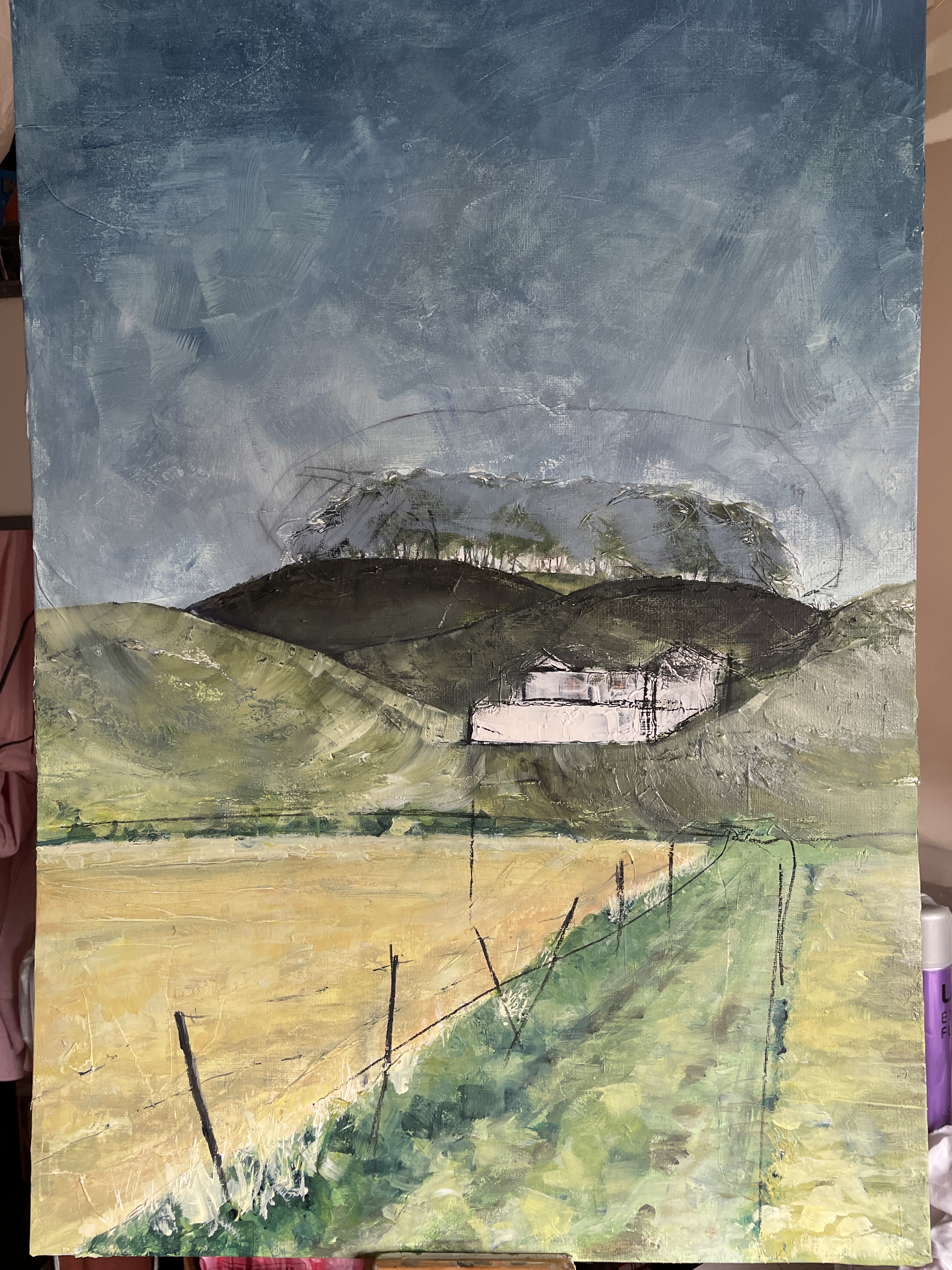
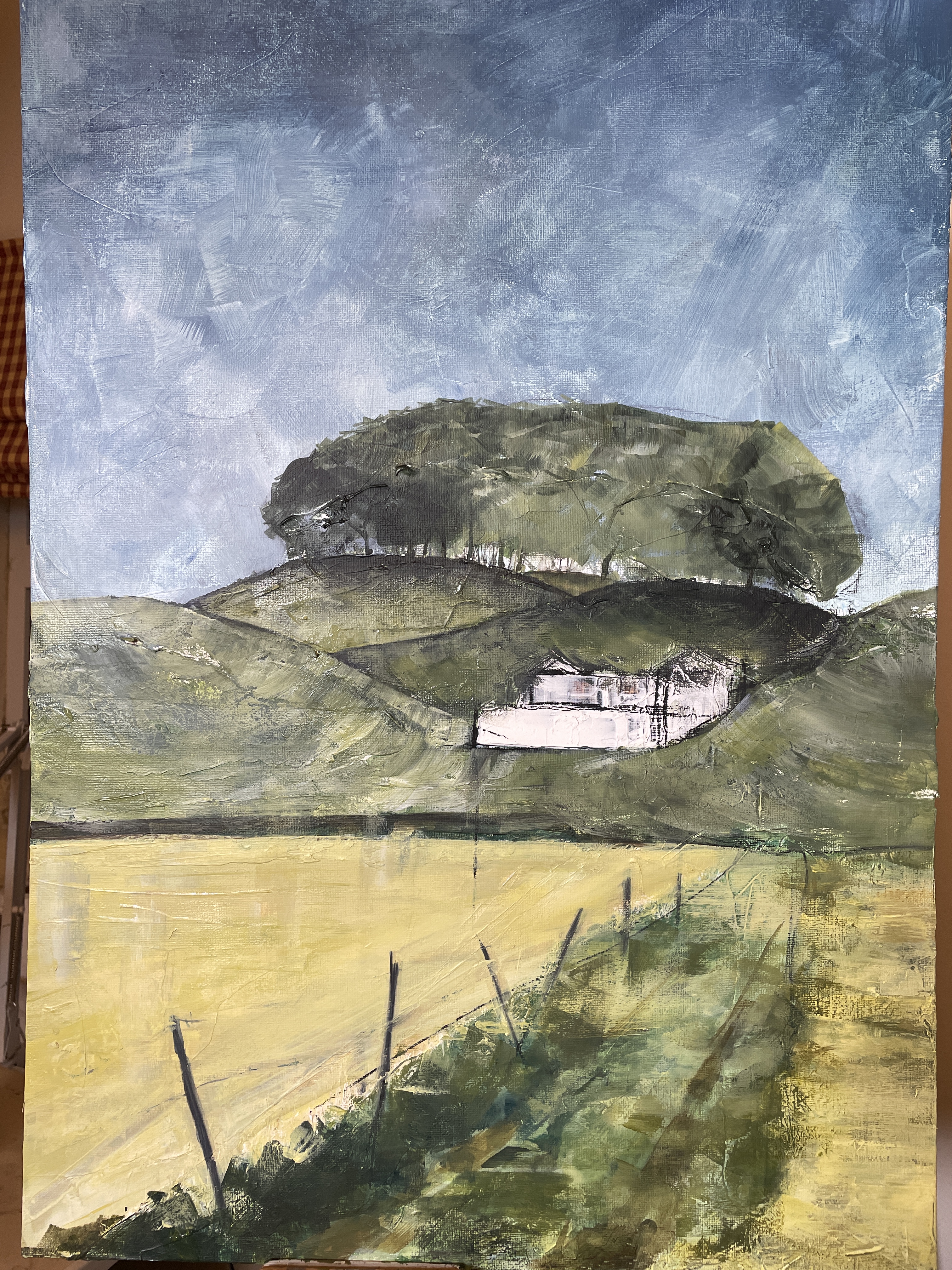
I started with charcoal pencil, then went for a change in colour and tried to use brush marks to describe the the rounded hill contours. I stuck with the building depicted in texture paste, liking the way it started to sit into the landscape but remained clearly as something added in. Anyway, I think it feels like it’s getting somewhere.
Now, I just need to pay attention to this rule!

Paint brushes down again and time to stand back and look – I’ll catch on in the end.
A sketch meet at Avebury had been scheduled for last weekend – it was cancelled but I’d wanted to spend some time drawing the stones so I thought, why not go anyway? The weather wasn’t exactly perfect (wind and drizzle forecast) but I decided to go with Sister Corita’s Rule 7: ‘The only rule is work. If you work it will lead to something – it’s the people who do all of the work all the time who eventually catch on to things’ and go anyway.
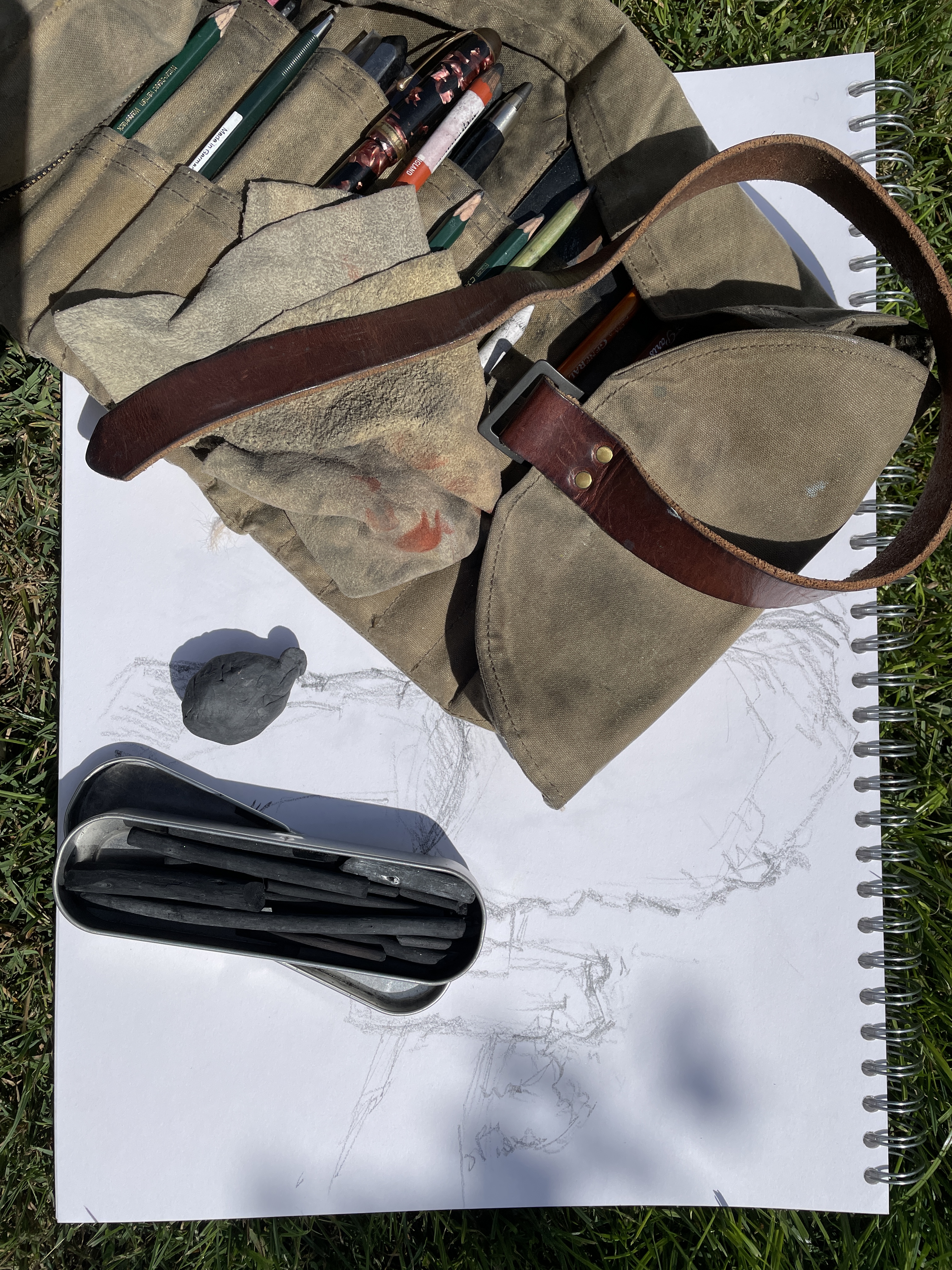
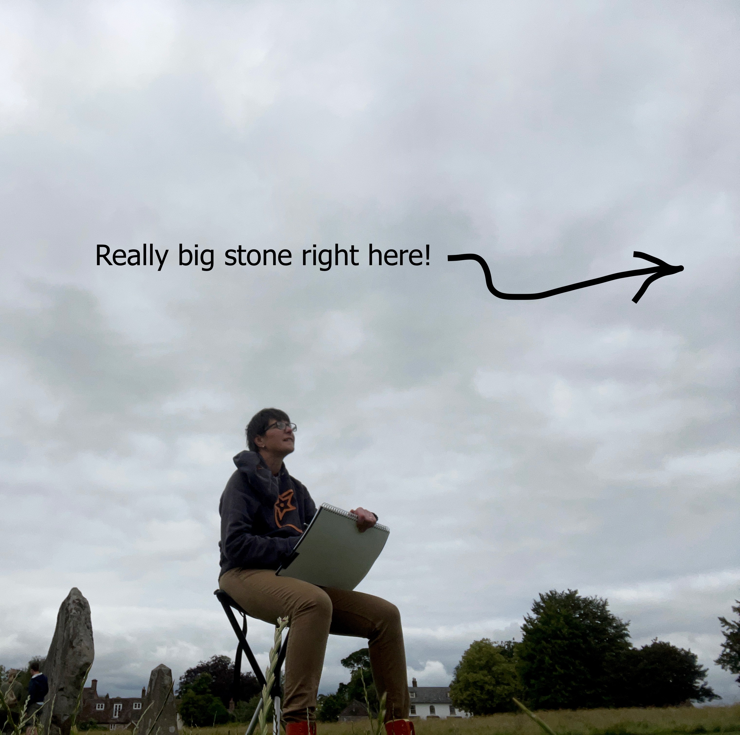

Initial sketches in graphite were fun but challenging as I struggled to get proportions of the standing stones right, stop the paper from blowing away in an increasingly strong breeze and not drop everything in the grass. Eventually I realised that it was also getting really drizzly. I sheltered under one of the stones, then made a run for it to the Henge Shop when the rain got too heavy. I spent a happy quarter of an hour checking out crystals and Tibetan prayer flags while the rain blew through.
Given my circulation only works as far as my elbows, my hands had got pretty cold. I went back out to the same spot as I wanted to do some charcoal drawing, but thought I’d do a blind continuous line drawing to get warmed up first. The other thing about drawing in a popular spot like Avebury is you get to chat to all sorts of interesting people too, and their dogs (including a very cute Akita puppy). Slows the drawing down, but definitely adds to the day. At least I had something to add to my pile of potential monotype material by the end of it.


Last weekend we went to see an exhibition of Michael Simpson – selected drawings at the Holburne Museum in Bath. I always love seeing sketchbooks, preparatory drawings, unfinished paintings, as you get a glimpse of the way an artist works. His drawings were beautiful, on a variety of surfaces (paper, cardboard, found papers and even paper napkins) and in a variety of media – it’s definitely worth checking out the link above. His continuous revisiting of a limited number of themes, the inclusion of found text – this made me want to go back to revisit some of my monotypes to rework them and push them on (after all, it’s what we were encouraged to do on the Portfolio Course :0) ), I just needed a reminder to do it).
I took a couple of the monotypes and started by adding some found text and then printing a layer of paler coloured ink over the top:


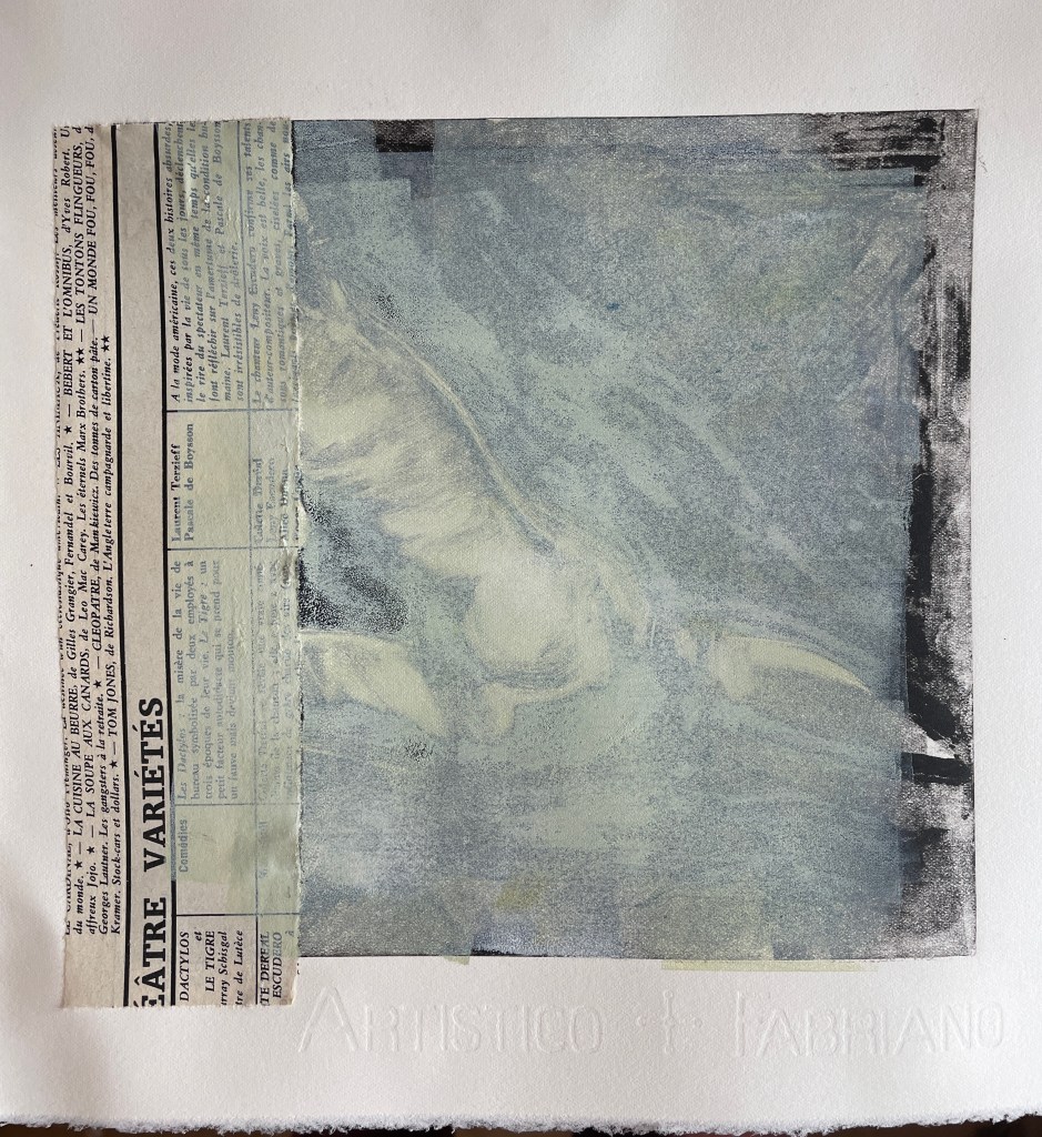

The next day (should have left it longer really, as the ink wasn’t dry enough, but I was impatient), I worked over the top of this. I wanted an image with quite spare but graphic line, so thought I’d try a trace monotype. This involves inking a plate, then lying your final piece face down on the top. You draw over the back – basically like using carbon paper – to pick up the ink. Not a very successful result, as you can see:
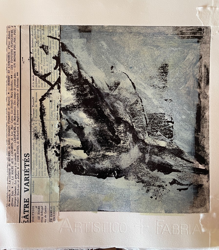
The bonus was that, not being particularly precious about the initial image, I wasn’t too worried when it didn’t work. More pale ink layers to come for this one I think! The second was more promising – using a traditional monotype approach:
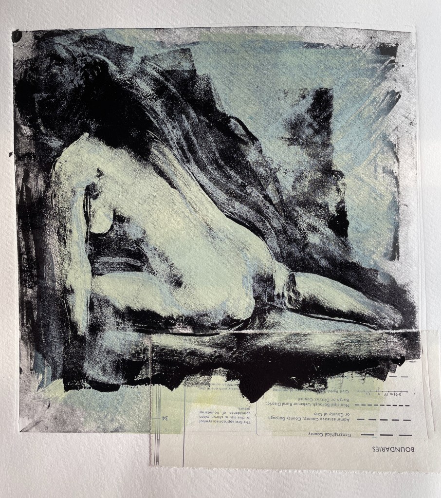
More to be done on this, but it feels like it’s going somewhere. I’m also thinking about the piece of the map key I’d added – somehow the word ‘boundaries’ feels important too. Apparently Leonardo da Vinci said ‘art is never finished, only abandoned’ – I’m nowhere near abandoning this one yet.
It seems that minutes must have got shorter, as I’ve not (yet) been able to find time to follow up on my initial monotype experiments. However, I did get good news on the print making front as a I found out that the linocut I entered in the Annual Open Art Exhibition at the White Horse Bookshop Gallery had sold…very happy printmaker :0)
Continuing the hawthorn theme, the may blossom has been amazing this year. When I originally made the linocut, I’d intended to make it the first in a series of four spanning the seasons. Walking the hound down the cycle path into Marlborough a couple of weeks ago I thought a charcoal sketch would be a good place to start, so I’ve been working on this:
Not entirely sure how this will translate into a linocut, but then, finding out is half the fun of the process!
I was also hoping to find some good poetry on hawthorns or may blossom as I do like to include text in my work too (even if it’s not visible in the final piece). I didn’t find anything specifically but I very much liked this quote from Kerouac from ‘The Big Sur’:
“On soft Spring nights I’ll stand in the yard under the stars – Something good will come out of all things yet – And it will be golden and eternal just like that – There’s no need to say another word.”
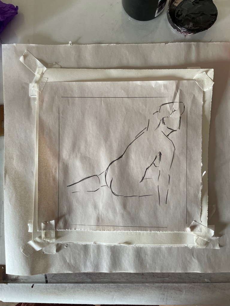
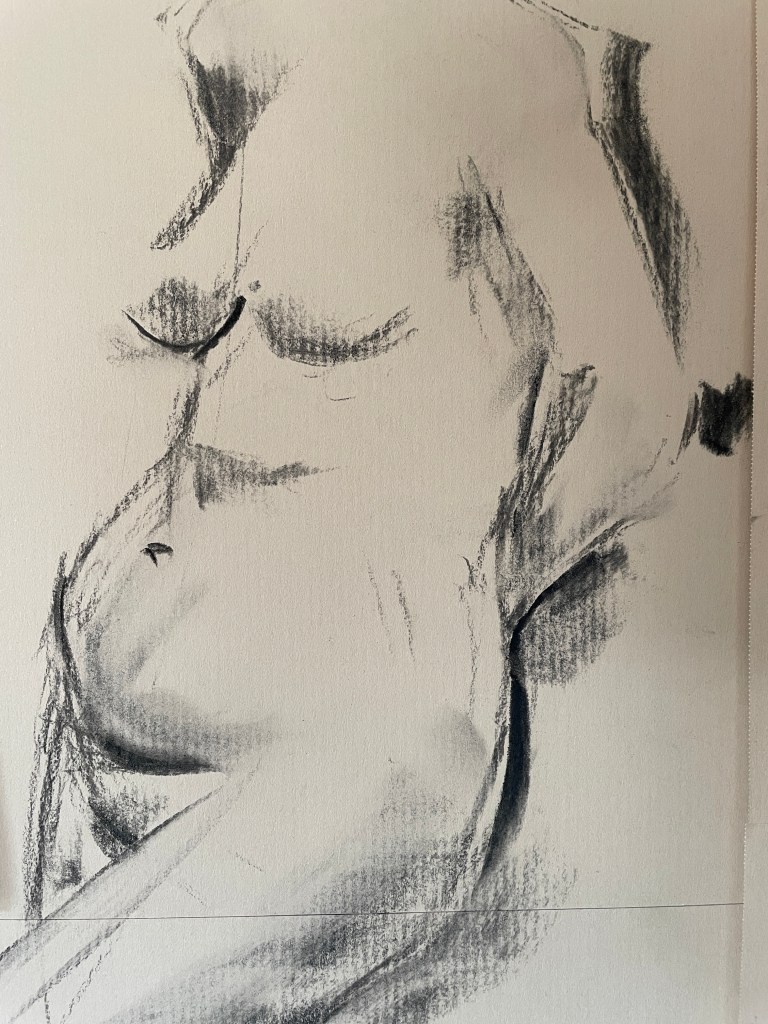
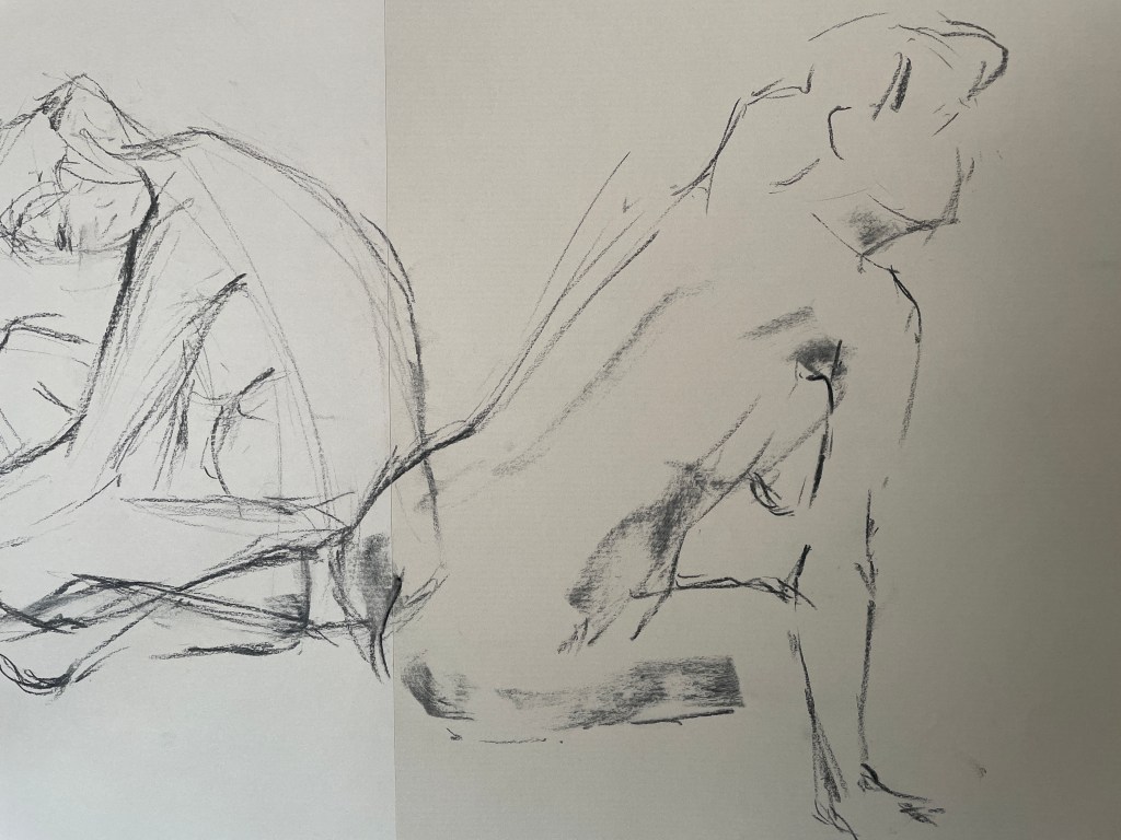
Having been away for a while and spent an absolutely amazing time on the Portfolio Course at Bridge House Art School in Ullapool, I’ve been trying to find a way to build on that experience now I’m back at work. One life drawing session later, and I’ve been having a great time playing with monotypes based on the sketches I made on the day.

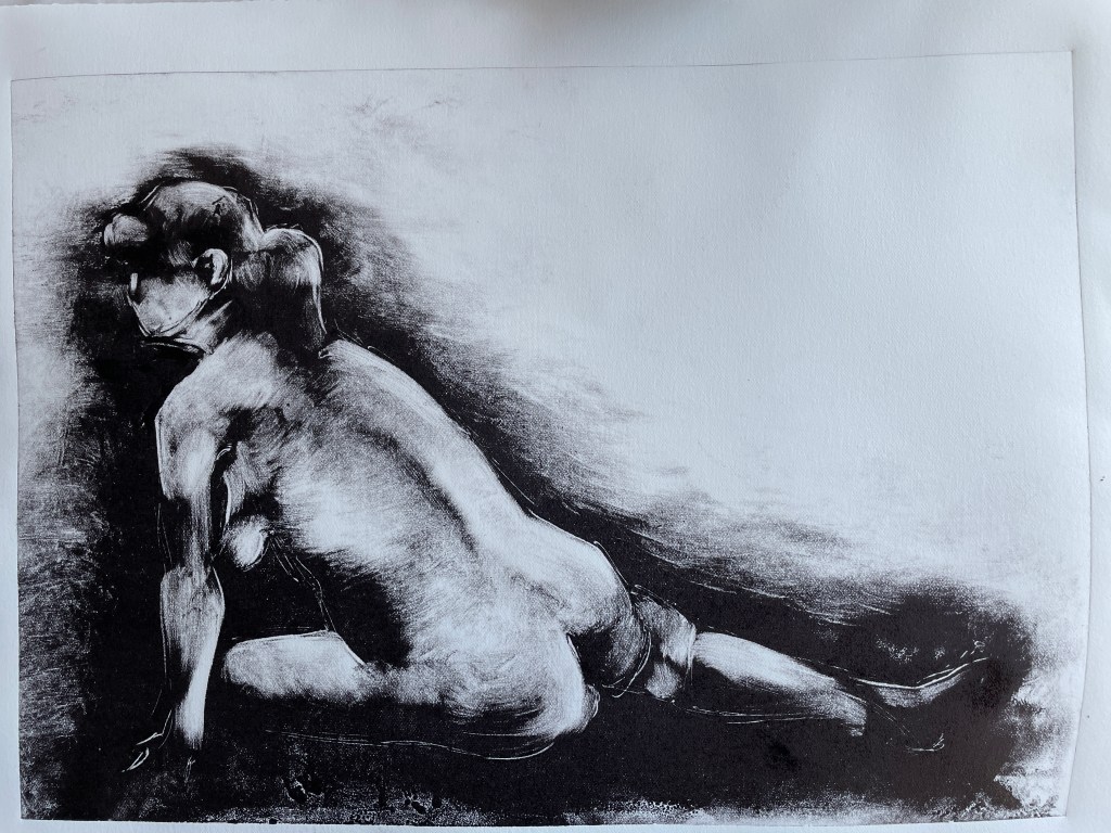
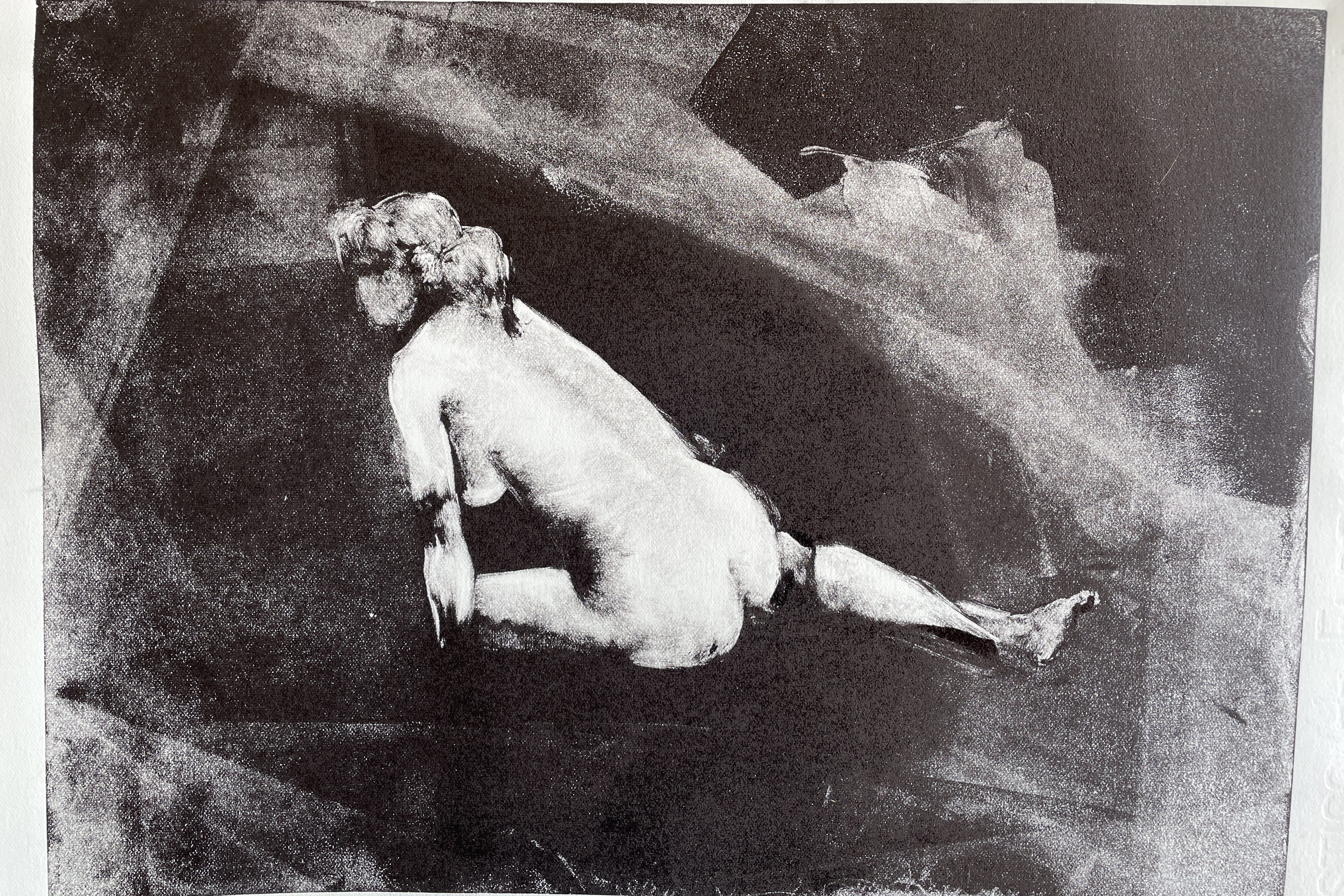
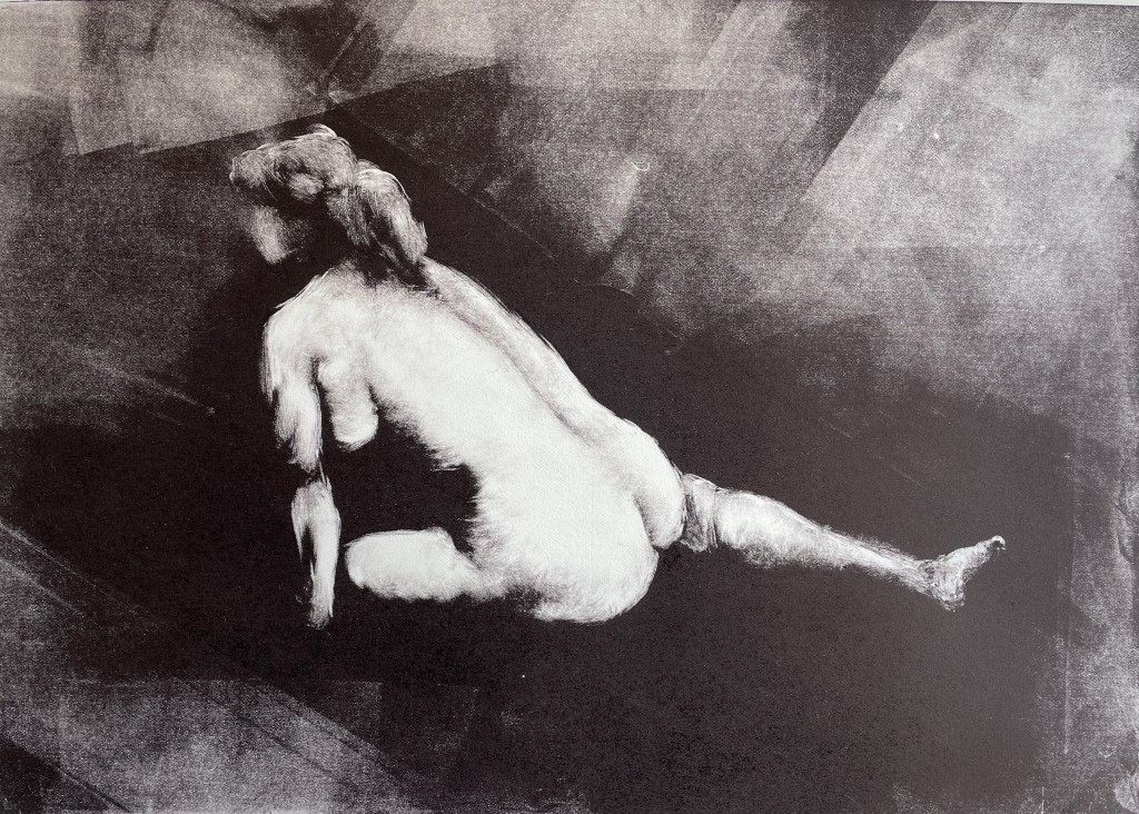
The first three attempts were on a glass plate (which I broke, being a little overenthusiastic with the pressure), rolling on ink and then wiping away. Feeling I was overthinking a little, I thought I’d try using an Oil Bar and draw on to a perspex plate (Kate and press proof). I used a combination of drawing with the Oil Bar, rolling on ink to different areas, painting it on, wiping away and drawing with a stick.
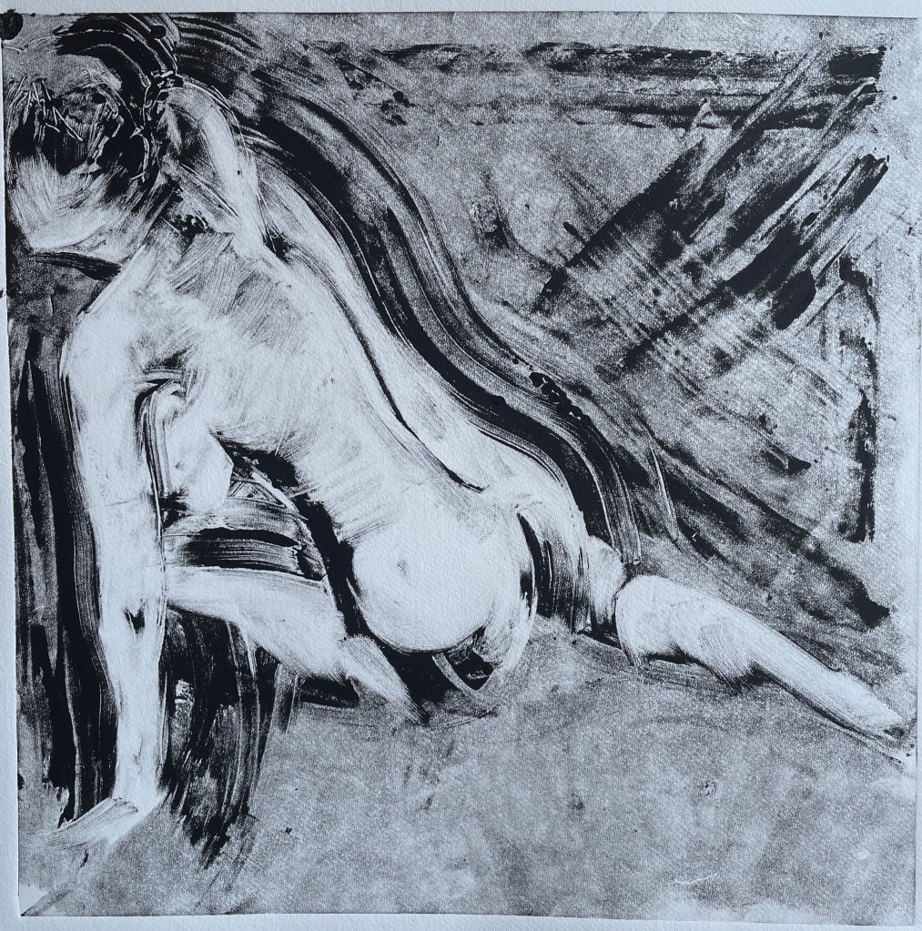
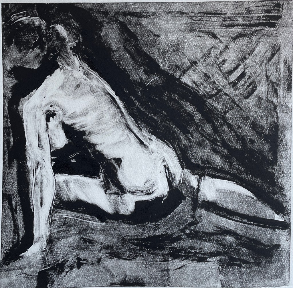
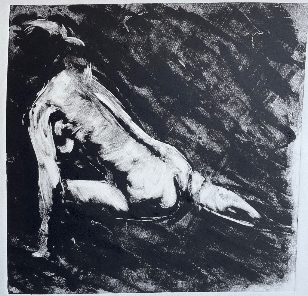
I’m happy with the initial prints – lots to develop and explore with the different marks and textures, and I’ve only worked from one drawing so far!
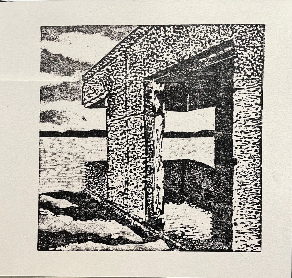
Having had some French polish delivered at the end of last week, I created another collagraphy plate so I could try out printing the same plate both intaglio (where you pull the ink from the troughs and cuts you make in the surface of the mount board) and in relief (where the ink comes from the high points in the plate).
Although I knew that shellac was used as a varnish to help seal the plate so it will last a little longer and is easier to ink and clean, I hadn’t realised that first, shellac was a resin produced by Indian beetles and second, that it was used in French polish. Anyway, this is the result of the intaglio printing – I did make the mistake of not photographing the print properly before I had a go at the relief print (the results of which I’ll put in the next post), so grabbed a screen shot from the time-lapse GoPro footage, but you can see roughly how it turned out!